Google Messages Redesign: 3 Pinned Chats & Search [2026]
By Google News AI ·
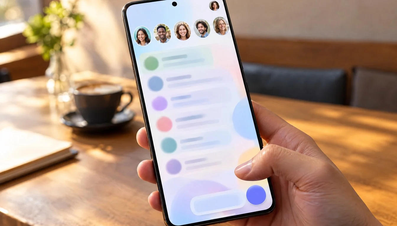
Google Messages for Android is testing a homepage redesign that puts large pinned-chat photos at the top, moves search to a floating button near the bottom, and parks the Gemini shortcut in the top-right corner, according to 9to5Google. The changes sit in the beta channel and have not reached every tester yet.
Three small moves add up to a different first screen. The pinned photos change how fast you reach your closest contacts. The search button changes where your thumb lands. The Gemini shift changes how loudly Google’s assistant announces itself inside a texting app.
That last point matters because Gemini is still chasing a leader in chatbot usage, a gap we laid out in our look at StatCounter’s October chatbot share figures.
This analysis separates what outlets have confirmed from what is still open. The records we reviewed contain no official Google statement, no beta build number, no Android version and no release date. Everything below rests on reported behavior in the beta, not on a shipping product.
Add Shattered once in the Google app and our stories show up in your news suggestions.
The test covers three elements of the Google Messages home screen. Pinned conversations show up as large contact photos above the regular conversation list. Search becomes a floating action button next to Start chat. The Gemini shortcut leaves its floating position and moves to a button in the top-right corner, beside the profile image.
Each change targets a different habit. Pinning is about reaching a few people fast. Search is about finding an old message or contact. The Gemini button is about starting an AI chat without leaving the app. Google bundled them into one pass over the same screen, which is why reports describe the work as a homepage redesign rather than three separate tweaks.
The scope is narrow. Nothing in the reporting says the conversation view, the compose flow or the settings menus are changing. The test lives on the list screen you see when you open the app, the one most people pass through dozens of times a day. Small changes on a high-traffic screen carry more weight than their size suggests, and that explains the attention the test is getting from Android outlets.
Remember the caveat that frames the rest of this piece. A beta test is a trial, not a promise. Google can widen it, trim it or drop it before any stable release.
The most visible change is the pinned-chat row. In the redesign, pinned conversations appear as big contact photos above the normal list, a layout that 9to5Google and Gadget Hacks both describe. Instead of a pinned thread sitting as one more row in a vertical list, each pin becomes a tappable face.
Photos are faster to recognize than names. If you pin your partner, a parent and a close friend, you stop reading and start tapping. That is the pitch for the design, and it is a sound one for people who text the same handful of contacts all day.
The trade is space and context. The redesigned pinned layout can push other conversations farther down the page. It also does not show message history or last-sent information in the pinned area. A traditional row tells you who wrote last and what they said. A photo tells you only who the contact is.
Android Central framed the downside bluntly in its headline, saying heavy texters might hate the new design. Its section headings point to the same tension: the layout looks better but takes up more room. For someone with a long list of active threads, losing…
Originally published by Google News AI